
If you’re looking at the title in confusion, we get it. Typeface and font are so often used interchangeably that many people don’t know that they are actually two different aspects of typography. Today we’ll simplify each, highlight the differences and give you a guide on how to use them.

Photo by Bich Tran on Pexels.com
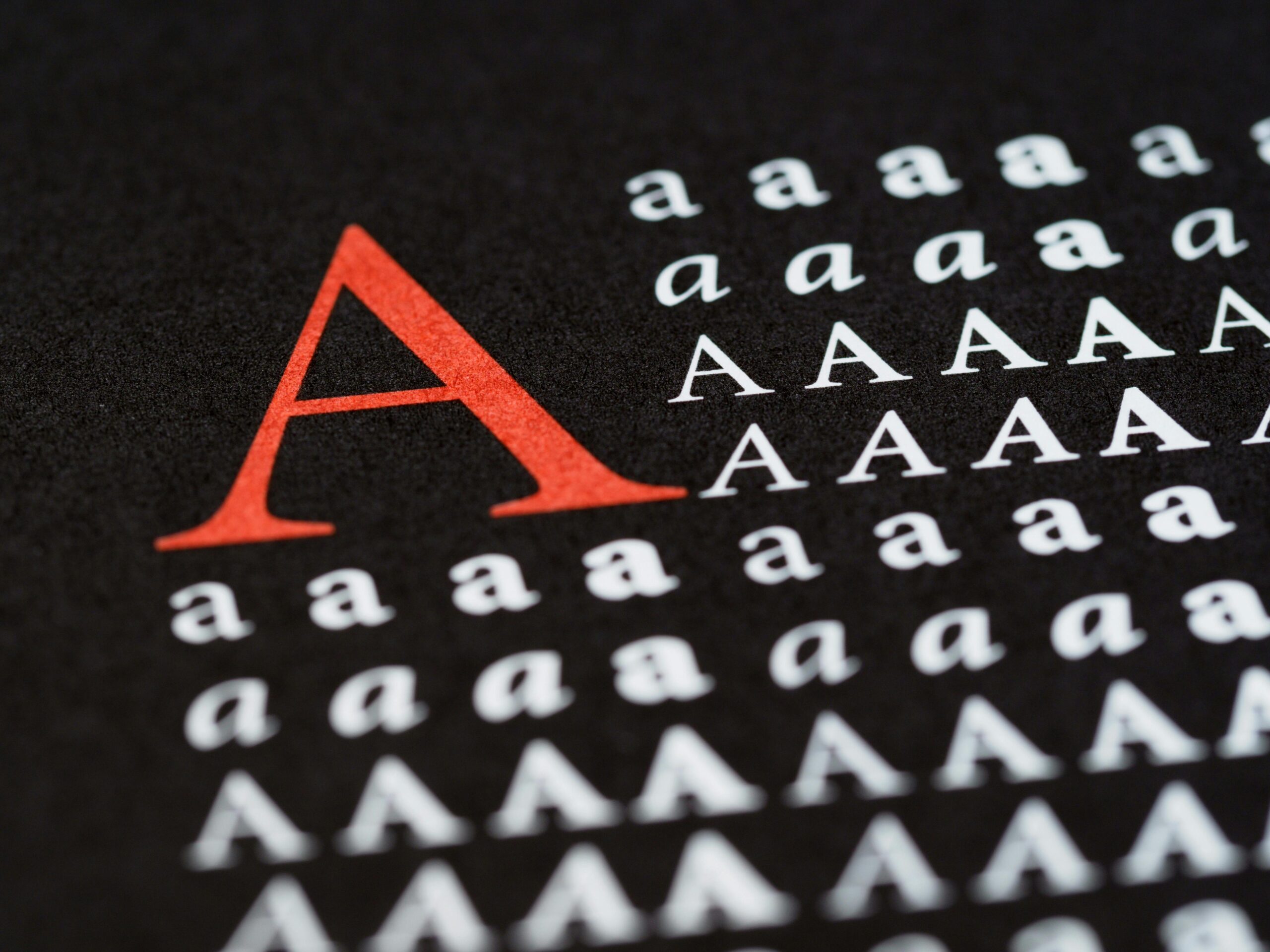
How Do They Differ?
A font refers to the design – size, width and style, that makes up a typeface. Fonts can be classified into five groups: serif, sans serif, script, monospaced, and display. On the other hand, typeface speaks to a family of fonts such as Helvetica or Times New Roman. Each typeface usually has variations such as extra bold, bold, regular, light, italic, condensed or extended. It must be noted that not all typefaces have multiple fonts. An example of this is Monotype Corsiva.
Typefaces have now evolved to include Typeface Superfamilies which combine typefaces of different design into the same family. These typefaces can include a combination of the five font groups. Lucida is one such typeface which has several variations, including script and serif.
Where Did The Confusion Arise?
With the dawn of digital typography, the differences between fonts and typefaces became less clear. This led to the terms being misused, even by those in the field. It is not uncommon to hear of typeface foundries referring to themselves as font foundries, even though this is incorrect.

Photo by Jeroen den Otter on Unsplash.com
Which Should You Use When
There was a time in most of our lives when we thought Comic Sans or Times New Roman were the absolute best typefaces in existence. An older, more cultured eye now knows better. The typeface and font selected for each aspect of a project – a logo, letter, article or poster, needs to be done after careful consideration.
What we often do not consider is that the lettering of our messages will aid in how well it is received. Here are some points to consider:
- Are the typeface and font legible?
- How do these selections pair with each other?
- Do any of the letters look confusing?
- Do they capture the tone or intention of my message?
Serif and Sans Serif are the main types to consider and are typically used together. These will usually make up the headings and body of your work due to how easily legible they are when used with large amounts of text. Scripts can also be used in titles as the beautiful, decorative look quickly draws attention. It is best to avoid using this look for large bodies of text as it will make it challenging to read.
Display, as the name would suggest, is best suited for large headings or titles as it calls attention to the rest of the body of the text. It pairs well with a sans serif or serif typeface.
Monospaced typefaces are probably the least frequently used in daily writing. These tend to be found in scripts for plays or programming text. The design of this typeface makes it easily distinguishable from natural-language text, hence its predominant use in coding.

Photo by Christina Morillo on Pexels.com
The main difference between a typeface and a font is that a font is a part of a typeface. The variation of fonts creates the typeface family. In design, each typeface and font serves a specific purpose and can greatly impact the effectiveness of your message. In our next article, we’ll explore the rules that must be considered when deciding on a combination of typeface.